Where the land runs dry.
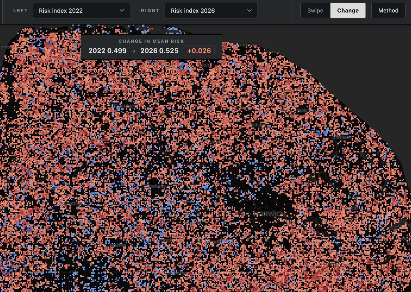
I wanted a drought-aware view of wildfire risk in Norfolk that held up across seasons. I combined Sentinel-2 imagery with rainfall and land-cover data in Google Earth Engine, compared five dry seasons, and built an interactive swipe map so anyone can see how risk shifts year on year. The live tool is embedded below.
I noticed most public wildfire risk maps are static and ignore how drought builds through a season. I set out to build a view that tracked moisture stress over time and was easy to read at a glance.
I processed Sentinel-2 scenes in Earth Engine, derived NDVI and NDWI for five dry seasons, and joined rainfall and land-cover data to weight the risk surface. Outputs were tiled for a lightweight web map.
An interactive swipe map lets anyone compare any two years side by side, with a short method note so the numbers can be trusted and re-run next season.