Every street
points somewhere.
Plot the compass bearing of every street segment in a neighbourhood and stack them into a circular chart, and you get an "orientation rose": a portrait of which way a place's streets actually run. A rigid grid draws four sharp spikes. An organic street pattern draws a soft, even ring. I used Barcelona to test this because it holds three completely different street logics within a few hundred metres of each other, and because I genuinely love the city, especially getting turned around in the Eixample's octagonal blocks, so this was a good excuse to look closely at how it's actually built.


A compass portrait of a neighbourhood
Every street runs in some direction. Measure the bearing of every street segment in an area, stack them into a circular histogram, and the shape that comes out is a portrait of a neighbourhood's directions. A rigid grid produces four sharp spikes, because nearly every street points one of four ways: north, south, east, or west. An organic, winding area produces a soft, even ring, because its streets head off in all directions at once.
That shape boils down to a single score from 0 to 1, sometimes written φ. A score near 1 means a strict grid. A score near 0 means a network with no dominant direction at all: a tidy way to say how ordered a street pattern is, so you can compare one area to another with a number rather than a hunch.
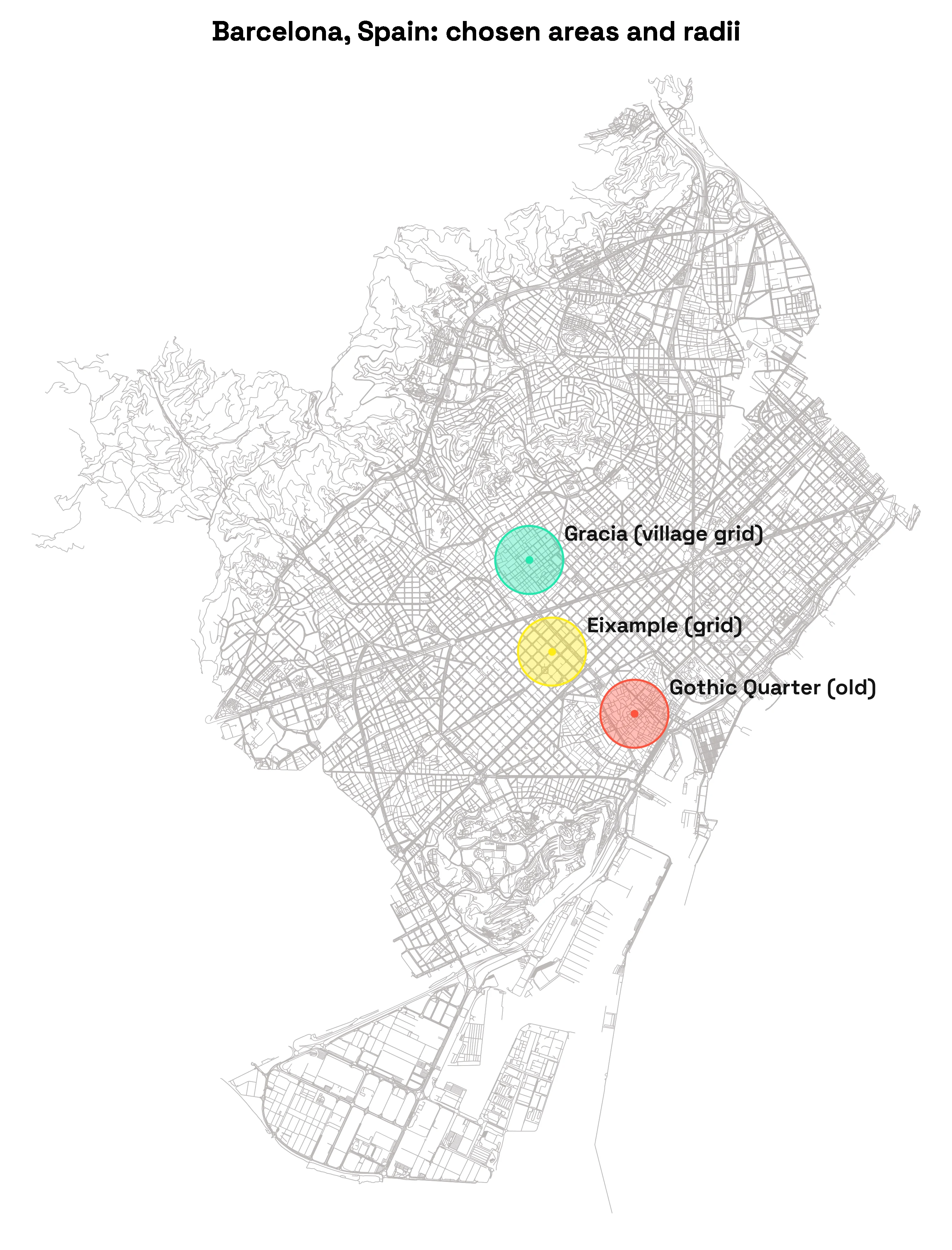
Same city, three different street logics
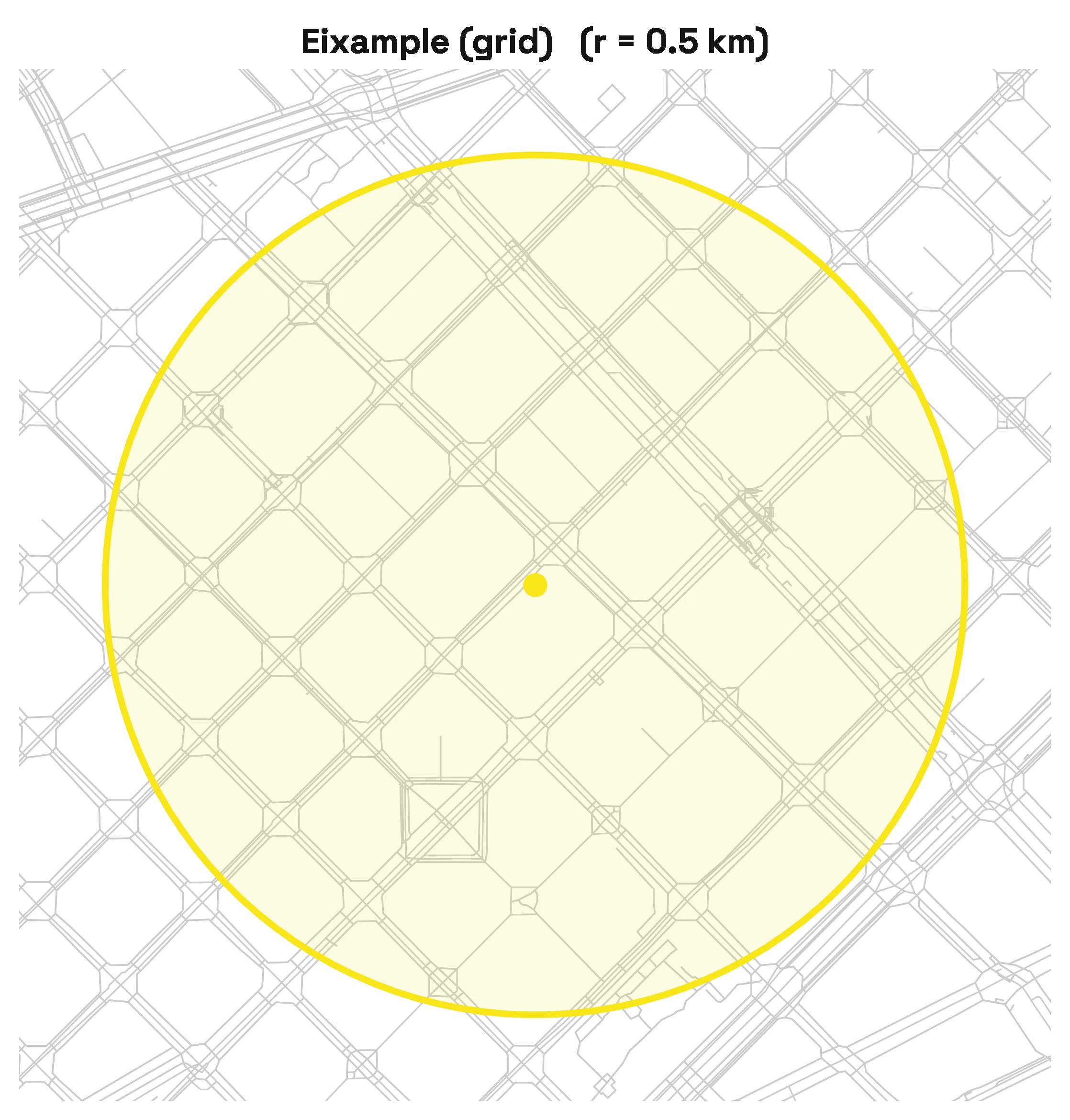
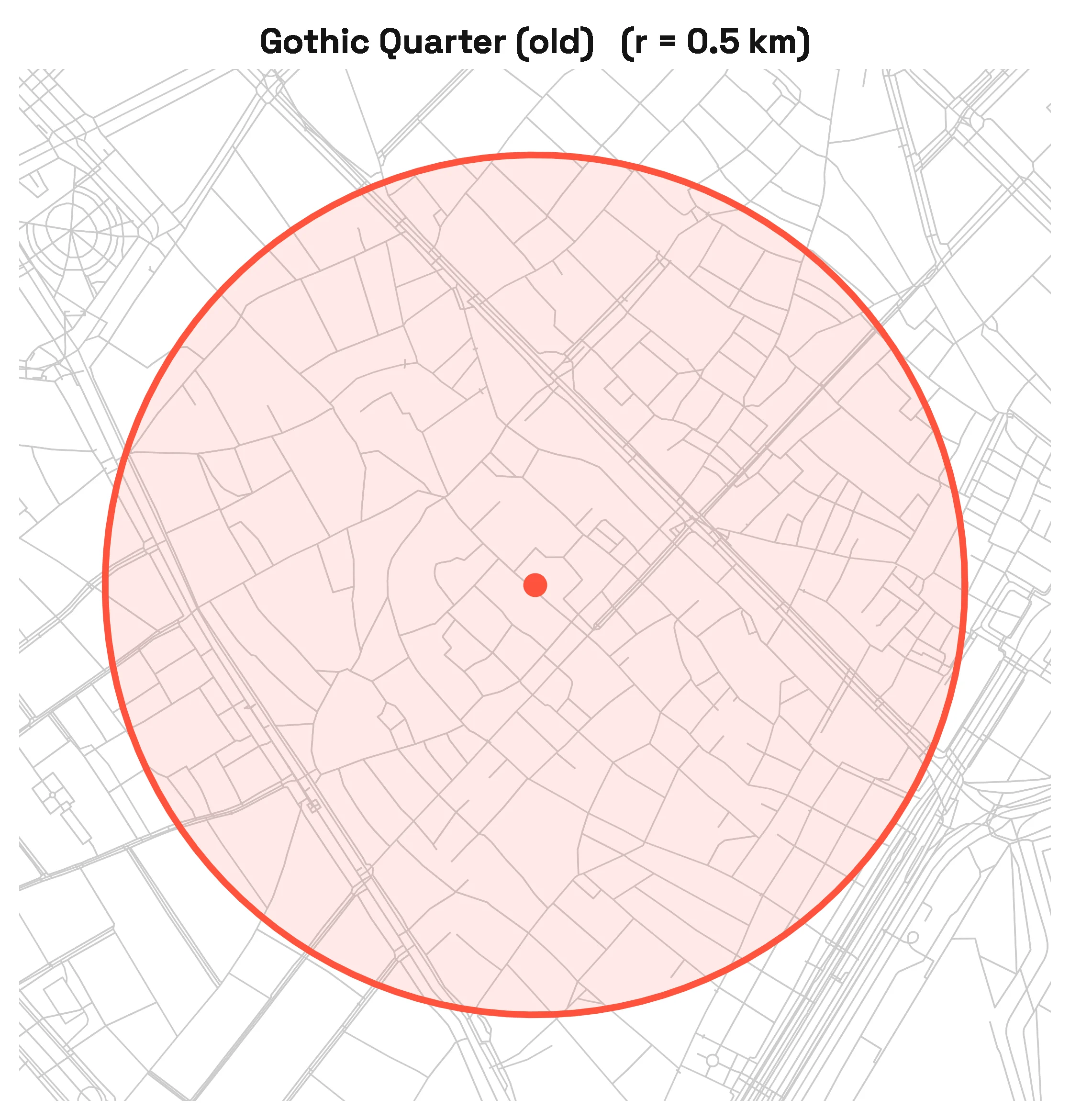
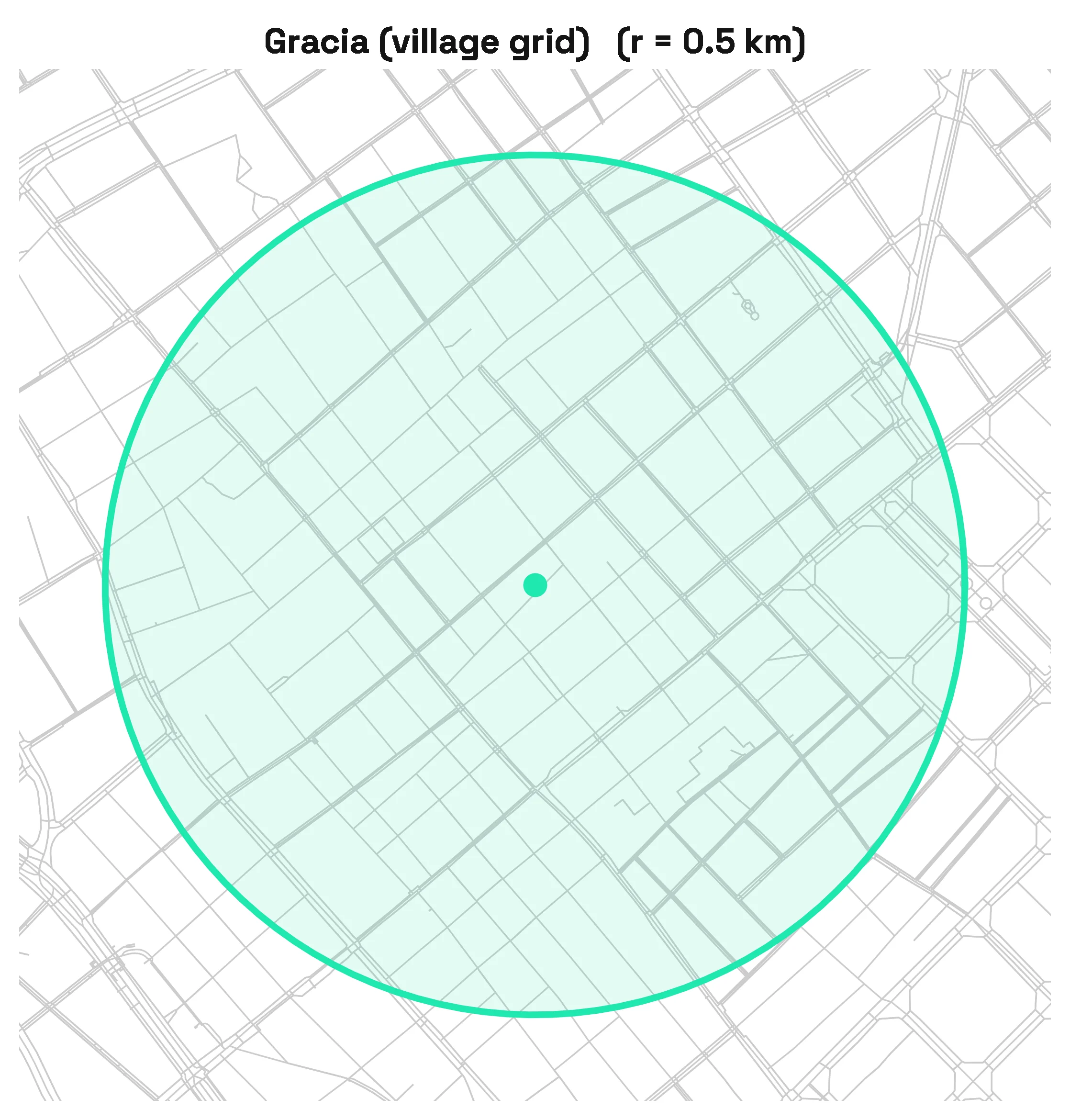
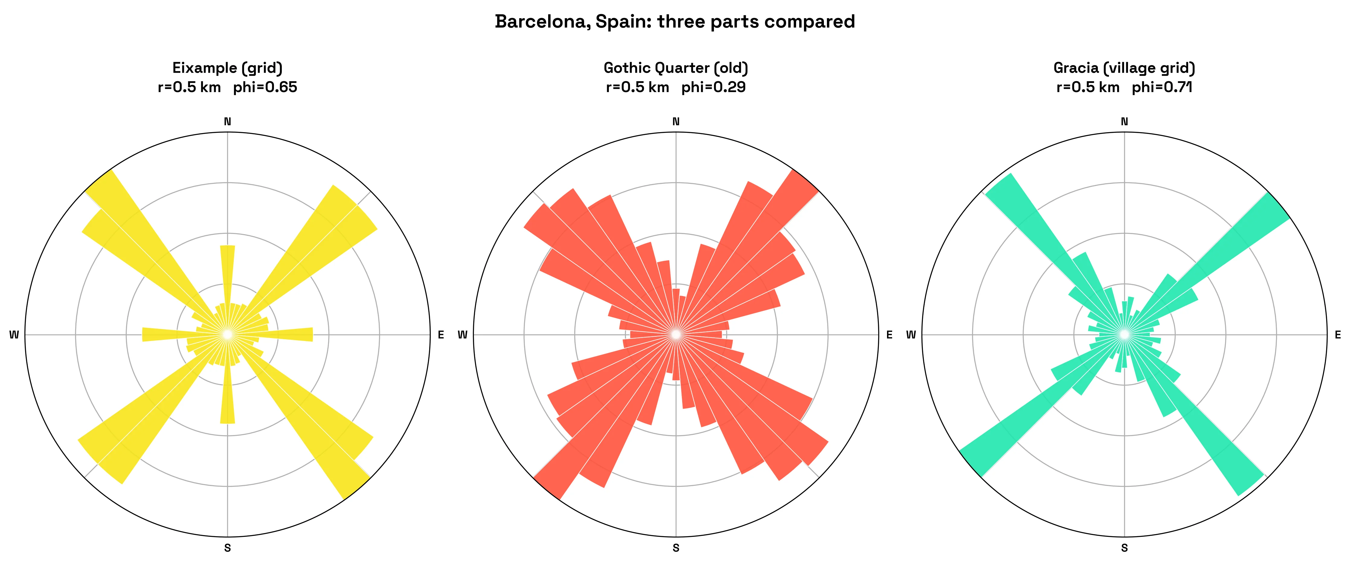
Look at a map of central Barcelona and two different cities seem to sit side by side. The Eixample is a near-perfect grid, block after block meeting at right angles, Ildefons Cerdà's 19th-century plan for octagonal blocks with chamfered corners. A short walk south, the Gothic Quarter is a tangle of narrow medieval lanes that bend and fork with no obvious logic. North of both, Gràcia is its own thing again: a former village swallowed by the growing city, gridded but at its own skewed angle, unrelated to the Eixample's.
One glance tells you which kind of place you're in
Run all three areas through the same rose, and the difference in street logic becomes impossible to miss. The Eixample throws up four unmistakable spikes, one per grid direction, with a score of 0.65. Gràcia is even more grid-locked at 0.71, just aimed at a different angle, off the Eixample's axis entirely, a leftover from when it was its own town. The Gothic Quarter is the outlier: a soft, near-even ring at 0.29, because a thousand years of streets bending around old buildings and property lines leaves no dominant direction to speak of.
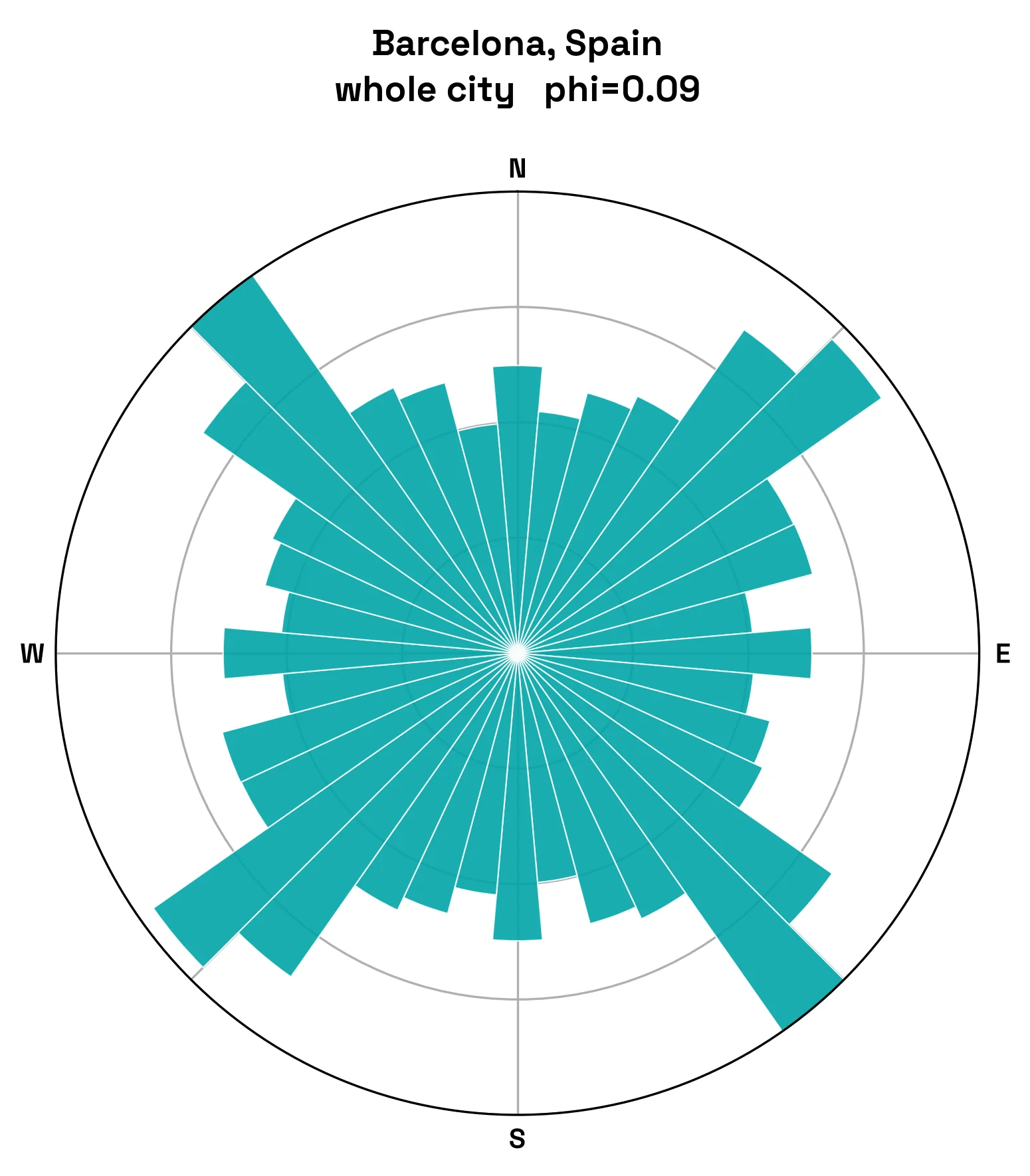
Zoom out to the whole city and the score collapses to 0.09, close to no dominant direction at all. That's not a contradiction: Barcelona isn't one street pattern, it's dozens of them stitched together, each district built in its own era at its own angle, and at city scale those angles cancel each other out. The orientation rose only tells a clean story at the scale of a single, coherent neighbourhood.
Grids are legible, old towns are memorable
Street arrangement has a direct effect on how easily people find their way. In a grid, you always know roughly where you are: turn left and you're heading a predictable direction, and overshooting a stop is easy to correct because the next street runs parallel to the last. Grids are legible; you can hold the whole pattern in your head. That's the Eixample.
Winding streets are harder to map mentally. There's no reliable "turn left and you'll hit it" logic in the Gothic Quarter, which is exactly why it's the part of Barcelona where tourists most often get lost. But the grid has a hidden cost: when every corner looks like every other corner, nothing distinguishes one junction from the next, and people can feel oddly adrift somewhere technically simple. Organic streets solve this by accident. Because the layout constantly changes, it produces memorable views, landmarks, and turning points that stick.
A quick read on a district's character and history
For planners and designers, orientation is a fast way to read a neighbourhood's history. High scores usually mean deliberate, top-down planning: land divided efficiently, often quickly, sometimes to impose order on a growing city, exactly what Cerdà did with the Eixample. Low scores usually mean slow, organic growth, or streets bending to follow hills, rivers, and old property lines, exactly what happened in the Gothic Quarter centuries earlier.
That read has practical value. A pure grid moves traffic and people efficiently and is easy to extend, but it can feel monotonous and struggle to create intimate, human-scale spaces. A looser network slows movement and creates enclosure and surprise, which many people experience as atmosphere and a sense of place, but it can frustrate deliveries, cyclists, and anyone in a hurry. Good design often borrows from both: a legible main structure so people can orient themselves, softened by variety, landmarks, and breaks in the pattern so the place still feels alive.
A study for something we feel but rarely name
Street orientation is only one lens, and it doesn't capture everything that makes a neighbourhood work. What it does, quickly and clearly, is turn something we feel but rarely name, the difference between a place that's easy to read and a place that's easy to love, into a picture and a number. That makes it a small but genuinely useful tool for understanding why some parts of a city feel effortless to move through, and others feel like a maze worth getting lost in. Barcelona happens to be a city with three excellent examples of both, which is as good a reason as any to keep going back.